You know, I’ve never exactly been super into precision platformers or highly skill-based games like Super Meat Boy. I’m well aware of my particular skill level and I am comfortable with the fact that I’m nowhere near the best. So I wasn’t expecting to do too well with Breaking Newton. I was, however, expecting the game to be much tighter than it ended up being.
What Goes Up Must Redefine ‘Down’
Breaking Newton is a skill-based 2D platformer built around speedrunning each level. The gimmick of this particular skill-based fast-paced platformer bonanza is that you cannot jump. Instead, you invert gravity, flinging yourself up to the roof or back down to the ground. And yes, if you were curious, you can flip gravity back and forth fast enough to hover in place or fly. This is actually a required skill for several levels.
To be blunt, Breaking Newton has one of the single worst tutorials I have ever played. The level design for the tutorial is fine and makes good use of antepieces that let you safely experiment with and learn new mechanics as they become relevant, but the problem is that the method of teaching you the controls is by having an image of your controller/keyboard take up about a third of the screen with labeled arrows explaining the purpose of each button. And some of the text can overlap, making multiple instructions illegible.
This is almost a perfect analogy for the entire game, really. The level design is usually—not always, but usually—on point and polished to a shine. But the design in other places is flawed and clearly not as well thought through.
I played on a controller, because why on Earth would I not play a skill-based platformer with a controller? The answer is that the developers did not intend this game to be played with a controller. The character does not move until you’ve pushed the stick all the way to the right or left, which makes the character feel unresponsive. Something that can be the matter of life and death in any level based around timing. Normally this would be fine, and I would instead use the D-Pad to get that level of responsiveness back.
Breaking Newton does not have D-Pad support.
So having concluded that, for reasons unknown to any mortal, this precision platformer was not designed for controllers, I tried it on mouse and keyboard. And I cannot believe I am about to say this, but if you play Breaking Newton, do it on a keyboard. It’s the least intuitive control scheme I’ve ever seen applied to a keyboard, but it feels much more responsive.
What do I mean when I call it unintuitive? Imagine, if you will, that you are playing a game on keyboard, and you wish to pause. What key do you imagine yourself pressing? The ESC key, if you’re me or generally sane. The ESC key is not how you pause Breaking Newton. The pause button is the space bar. I’ll give you a moment to process that.
The keys are all over the place too. Enter is the quick restart button, and ‘W’ and ‘S’ are the gravity switching buttons, or just ‘S’ on one-button mode. So one hand is on the arrow keys, and the other hand has to wildly fling itself around the keyboard to get anything done.
Another way that Breaking Newton is not as well constructed as it should be is how it handles progression. I mentioned before that the game is built around speedrunning. The faster you complete a level, the more stars you earn, up to five. But there’s a catch: dying reset you back to the start of the level, but it doesn’t restart the level. In other words, moving obstacles continue where they were when you died, changing the timing of every obstacle in the level.
You also have a quick-restart button that does restart the level completely, as well as your timer. But the timing is so tight on many obstacles and on getting the coveted Five Star rating, that you’re better off restarting the moment you die.
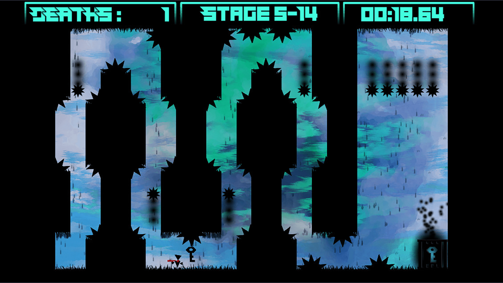
Dying also causes you to lose any keys or collectibles you grabbed on your previous attempt, but there is a slight pause between you respawning and the items resetting. How long is that pause? Just long enough to make you think that they don’t respawn if you were glancing at it to check. Keys, at the very least, are obviously reset on death as they unlock the level exit, and the level exit is very clearly locked again should you die with the key in your possession.
I also haven’t figured out what the player hitbox is yet, which makes it hard to know when I am or am not in a safe location when I’m waiting for a laser or saw or whatever to pass by me so I can continue. I think it might be the player sprite, pixel perfect, rather than what many games do and have an invisible collision check within the character, allowing you to slightly overlap some obstacles safely.
To be honest, I’m actually somewhat annoyed by how well the levels are designed. The levels are all tightly made and well put together, but the somewhat unresponsive controls make what could be really interesting challenges into frustrating slogs. If the levels were also bad, then I wouldn’t have any reservations with despising the gameplay.
Well, I say that, but there are some obstacles that are placed in a way that’s visually confusing. For example, there’s a level where you have to drop down a hole where two opposing spike launchers are shooting up and down. The trick is that the spikes are right next to each other, and I kept misreading it as them going up, hitting the roof, pausing, and then coming back down. But that wasn’t actually what was happening.
They were both being fired one way. But a spike launcher has the spike appear in the wall for a few seconds before firing, and since these spike launchers were firing in opposite directions, I misinterpreted what I was seeing because the moment the spike hit the wall and vanished, a new spike appeared right next to it.
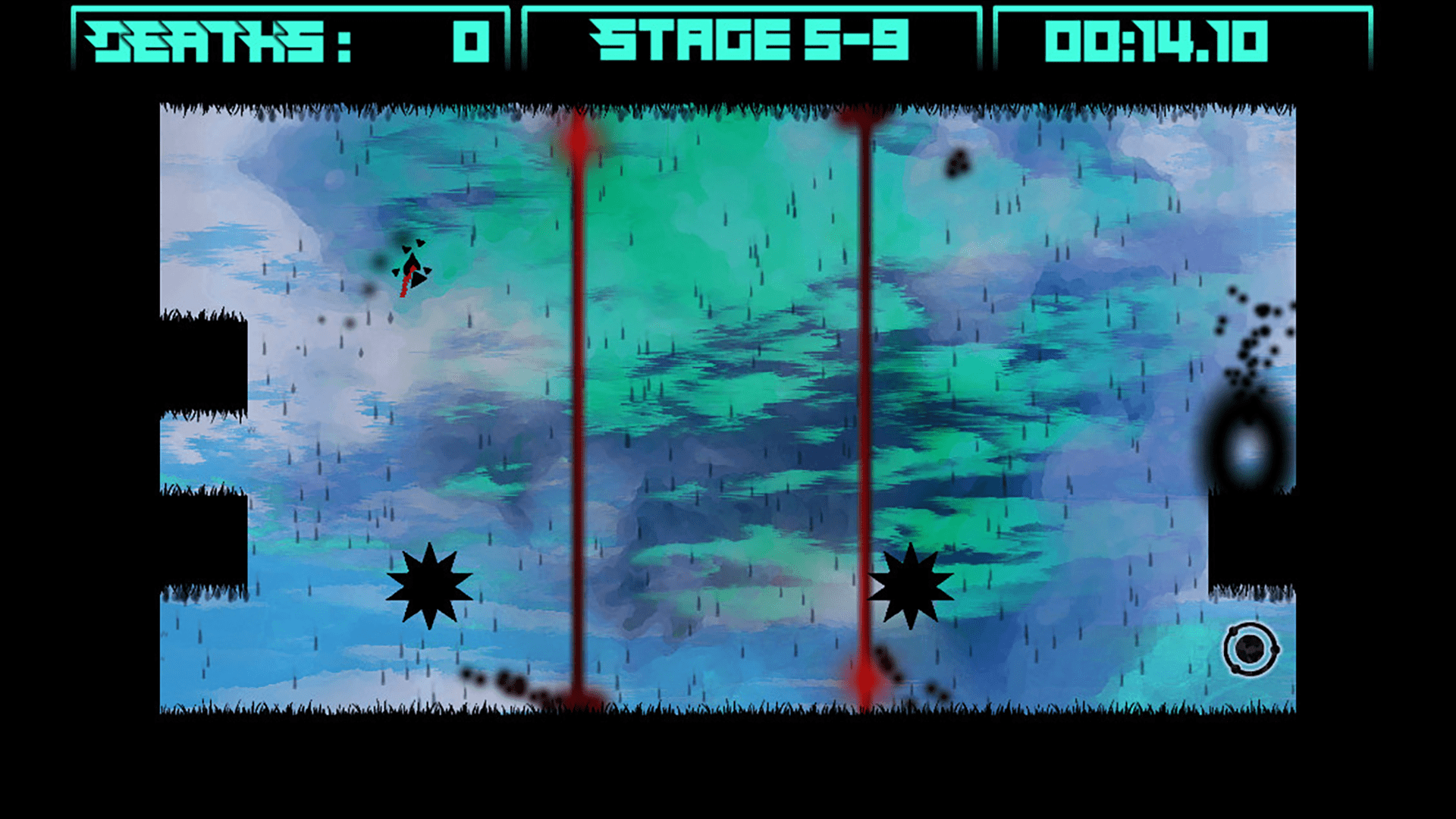
But lasers are by far the biggest offender for visually confusing obstacles. The smoke effect from the end of a laser is small enough that I struggle to tell which way a laser is firing from. And that’s pretty important when I need to plan my path to keep something between me and the laser at all times.
Breaking Newton has some really interesting ideas around the gravity changing mechanic. Several obstacles are affected by gravity like you are, and navigating around them when you also need to manipulate you own gravity is legitimately interesting. There’s also an obstacle later on that I think is supposed to be water or something, and it reacts to gravity too. Watching this (very simplistic) fluid simulation fling itself up and down the screen is actually really satisfying.
Free! Free Falling!
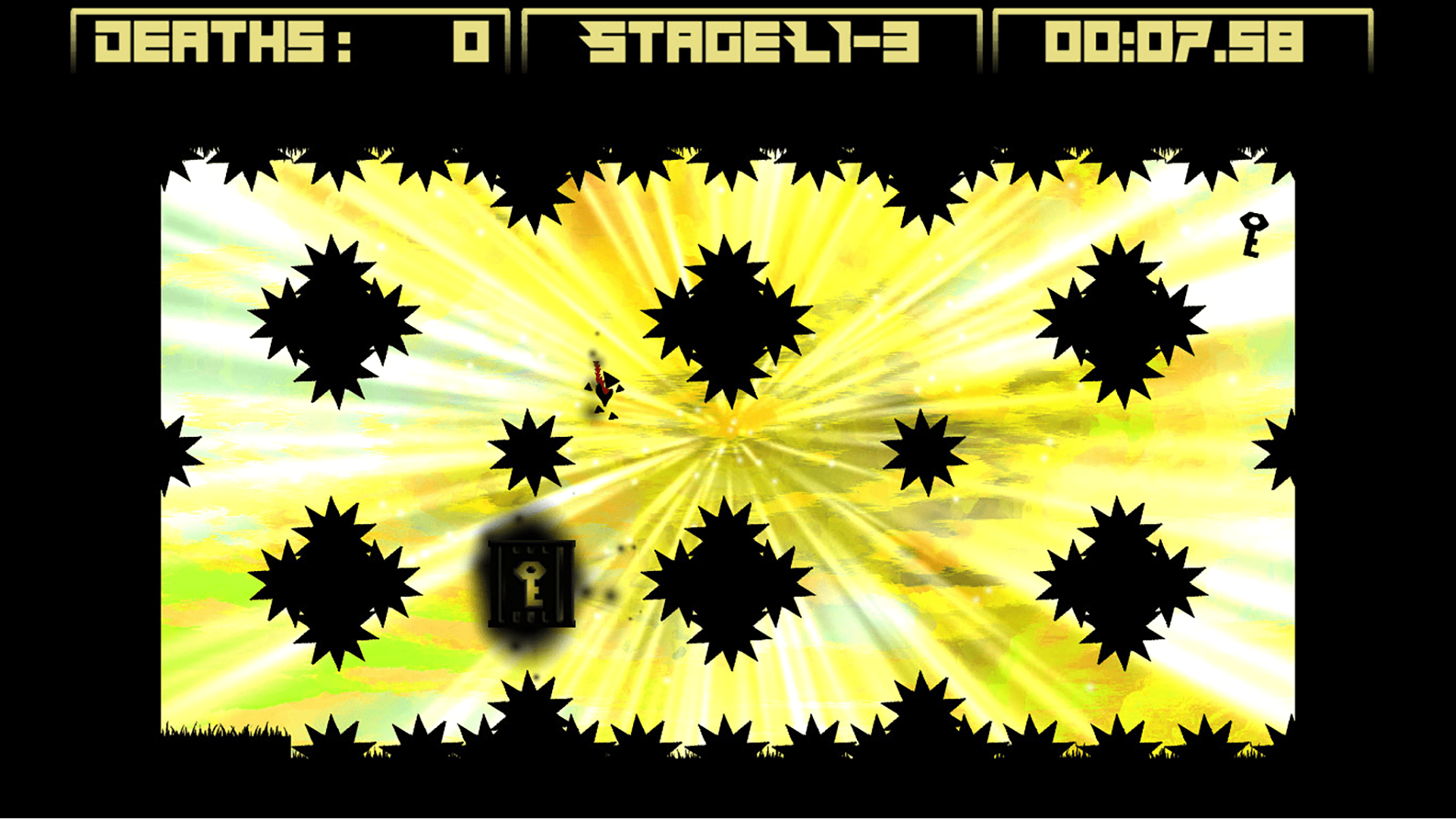
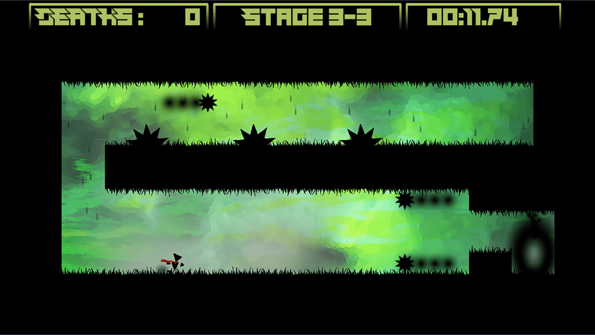
Breaking Newton is another indie game with a silhouette aesthetic. Literally every single important thing in the game is black, with the exception of your character’s cape, that maybe-water I mentioned earlier, and the collectibles in some levels, which are instead red, white, and a dark gray respectively. This stark black look makes it incredibly easy to tune out visual noise and focus only on what is important
The floors and ceilings are always covered in grass though, and I have no idea why.
Also Read
Transmogrify PC Review: The Best Way To Defeat An Enemy
Transmogrify is a game with a strong central idea let down by a shoddy execution resulting in an experience that is…
Defy the Gods as a Witchy Moon Goddess in Hades 2
Supergiant announces Hades 2 for 2023 at the 2022 Game Awards. The sequel promises dark sorcery, witchery, and more frenetic roguelike…
The backgrounds are impressive paintings or watercolors. I don’t know if they’re actually painted/watercolored or if they’re digital art made to simulate those styles, but they are very pretty. Each world in the game has its own unique background, so you can generally tell at a glance what world you’re on.
But beyond that, the art is functional. I mean that in the most literal sense. The art was made to work, and it does, but that leaves very little room for being pretty. The grass is almost the only detail in any of the game’s art. The player character is a Rayman-esque humanoid made of five floating triangles. You don’t have arms or legs; you have free-floating hands and feet. Heck, your scarf is also a series of triangles glued together so that they’ll flow like fabric.
Several obstacles reuse the same image. Namely, one of the gravity-obeying obstacles is a sawblade, the same sawblades that are generally embedded in walls (or the walls are made entirely out of sawblades) and a smaller version of those sawblades sometimes shoot out of walls. Keep in mind that I’ve named the three most common hazards in the game, and they’re all the same sprite! Again, the visuals are functional. You aren’t going to mix up any of these three. But it is worth noting at the very least.
Wind Rushing Past My Ears
‘Functional’ is a word I would use to describe the sound as well. The game has approximately four sound effects, not counting the menus. Your footsteps when you’re walking, the sound it makes when you change gravity, your death sound, and the hum of a laser beam. And I don’t know why they bothered with the footsteps considering how much time you spend flinging yourself wildly through the air.
There’s also an announcer at the start of a level, who is there solely to say “Ready? Go!” when you start the level or quick restart. I never got sick of his sound effect, thankfully, no matter how many times I reset the level, though I did get sick of waiting on him.
Breaking Newton also has music. It’s not bad, I kind of dig the beat, and each world has its own song. But if I learned the developers nabbed them from a royalty-free song archive, I wouldn’t be surprised if you get what I mean. I started playing my own music or video on my second monitor instead. The music doesn’t exactly set the mood of a precision platformer, and resetting a stage restarts the song, so I only ever heard the first 10 to 20 seconds, 30 if I was really struggling and gave up on a five-star rating.
Conclusion
Breaking Newton has a brilliant central mechanic for a platformer and a good understanding of not only that mechanic, but ways to take that mechanic in new and interesting directions with well done levels. Unfortunately, the game lacks polish in nearly every area, resulting in an experience that could have used some more time in the proverbial oven before it was ready for release.

